Peter
15 Mar 2008
Historical Data on Global Warming
Historical Data on Global Warming
provided by U.S. Government Agencies
By Dan Pangburn, P.E.
I have been researching the global warming issue for months. I am a licensed Mechanical Engineer with an MSc in Mechanical Engineering. The following is a brief verbal description of some of my sources and findings with graphics that show these findings.
Climate obviously has changed and will continue to change. But the observation that ice is melting, which can look dramatic on TV, does not show that human activity is the cause. The assertion that humans have or ever can have a significant influence on climate such as by limiting the use of fossil fuel (a.k.a. limiting human production of carbon dioxide) is not supported by any historical record. Avoid the group-think ‘consensus science’ and de facto censorship by Climate Scientists. Directly interrogate official government data that taxpayers have paid for from ORNL and NOAA as follows:
The temperature1 has varied substantially while the carbon dioxide in the atmosphere2 exhibits a smooth progressive rise. Note on this graph that prior to about 1910, and again from 1944 to about 1976, temperature showed a decreasing trend while atmospheric carbon dioxide level was increasing. Thus, as shown on this graph, until 1998 the average global temperature trend and atmospheric carbon dioxide level went in the same direction about half the time and in opposite directions the other half. The temperature rise that received so much attention and contributed to the Global Warming mistake lasted for about 22 years from 1976 to 1998. The temperature stopped significant increase in 1998. According to NOAA data, the average global temperature trended down during 2007 to lower than it was in 1998. This down-trend continues with the average for the first two months of 2008 being substantially lower.

1. Temperature from 1880 through 2007 from http://www.ncdc.noaa.gov/oa/climate/research/anomalies/anomalies.html with most recent by month at http://www.ncdc.noaa.gov/oa/climate/research/2008/perspectives.html
2. Carbon dioxide level through 2004 from http://cdiac.ornl.gov/trends/co2/ and from 2004 to current from http://www.esrl.noaa.gov/gmd/ccgg/trends/
In the previous graph it appears that since 1976 the increasing carbon dioxide level has caused the average global temperature to rise. However, a close look at the graph below3,4 reveals the fact that, typically in the past, global average temperature rose or fell before the carbon dioxide level changed.
In the previous graph it appears that since 1976 the increasing carbon dioxide level has caused the average global temperature to rise. However, a close look at the graph below3,4 reveals the fact that, typically in the past, global average temperature rose or fell before the carbon dioxide level changed.
Advocates of the idea that recent human activity has caused global warming rationalize this lag of carbon dioxide change to temperature change, which existed before human activity was an issue, with the theory that something external started the temperature change, the temperature change caused carbon dioxide change and then a positive feed back effect from the added atmospheric carbon dioxide caused the temperature change to continue. However, as the temperature record shows, temperature change began and ended at many different temperature levels. This would not be possible with significant positive feedback. Thus significant positive feedback did not exist then and does not exist now. Back then the atmospheric carbon dioxide increased as the ocean temperature increased driving out dissolved carbon dioxide into the atmosphere. The current atmospheric carbon dioxide increase is all a result of burning fossil fuel. Added carbon dioxide has no significant influence on average global temperature. Global average temperature change must be driven by factors other than carbon dioxide level.
Although the time scale on this graph can make times look close together, the change in atmospheric carbon dioxide level typically lagged average earth temperature change by hundreds of years. Note especially the period around 112,000 years ago when the decline in carbon dioxide level lagged the decline in average global temperature by thousands of years. Also on this graph, observe that temperature went up and down quickly and frequently while carbon dioxide level changed comparatively slowly. Note also that this graph is in years before 1999 so the present time is at the left side of the graph.
 3. Temperature change (or anomalies per their terminology) are per the Vostok, Antarctica ice cores from http://cdiac.ornl.gov/ftp/trends/temp/vostok/vostok.1999.temp.dat
4. Carbon dioxide levels from http://cdiac.ornl.gov/trends/co2/vostok.html
This graph also shows that global temperature change is not significantly influenced by atmospheric carbon dioxide level change. Sargasso Sea Surface Temperatures5 were compiled from proxies and reported at Keigwin, L. D. (1996) Science 274, 1504-1508. These temperatures are corroborated by historical records of colonizing and abandoning Greenland, vineyards in England , freezing of the Themes, etc. Anomalies determined from the Sargasso temperature data (obtained by subtracting 22.6 from all temperatures) agree only crudely with anomalies from Vostok3. Although Sargasso temperatures are corroborated by historical records of events, they may have been heavily influenced by ocean currents and thus be less representative of global average temperature. Sargasso anomalies are shown for the period that they are available.
3. Temperature change (or anomalies per their terminology) are per the Vostok, Antarctica ice cores from http://cdiac.ornl.gov/ftp/trends/temp/vostok/vostok.1999.temp.dat4. Carbon dioxide levels from http://cdiac.ornl.gov/trends/co2/vostok.html
This graph also shows that global temperature change is not significantly influenced by atmospheric carbon dioxide level change. Sargasso Sea Surface Temperatures5 were compiled from proxies and reported at Keigwin, L. D. (1996) Science 274, 1504-1508. These temperatures are corroborated by historical records of colonizing and abandoning Greenland, vineyards in England , freezing of the Themes, etc. Anomalies determined from the Sargasso temperature data (obtained by subtracting 22.6 from all temperatures) agree only crudely with anomalies from Vostok3. Although Sargasso temperatures are corroborated by historical records of events, they may have been heavily influenced by ocean currents and thus be less representative of global average temperature. Sargasso anomalies are shown for the period that they are available.
The Vostok ice core data provide carbon dioxide level4 only until about 340 BC. More recent data on atmospheric carbon dioxide level is provided by ice cores from Law Dome6, Antarctica and atmospheric sampling at Mauna Loa . Vostok and Law Dome carbon dioxide data are both plotted on the following graph along with the Vostok3, Sargasso and recent1 temperature data. This shows that, during the current interglacial period, temperature changes occur while carbon dioxide level undergoes little change until about 1750AD. This demonstrates that global temperature change does not depend on atmospheric carbon dioxide level change. As shown on the previous graph, if temperature change was maintained long enough the atmospheric carbon dioxide level followed.

5. Sargasso SST ftp://ftp.ncdc.noaa.gov/pub/data/paleo/contributions_by_author/keigwin1996/
6. Law Dome carbon dioxide data http://cdiac.ornl.gov/ftp/trends/co2/lawdome.combined.dat
This graph is a higher-resolution time scale of the previous graph showing detail of the last 1000 years with several other sources of carbon dioxide data added. The added data corroborate the Law Dome data and continue measurements of atmospheric carbon dioxide level to the present time from Mauna Loa7. This graph shows that the average global temperature 400 years ago was significantly higher than now and the recent rate of temperature change is not unusual. Recent measurements show that average earth temperatures in 2006 and 2007 were slightly lower than in 1998 and the average temperature for the first two months of 2008 is substantially lower.
For most of earth’s history carbon dioxide level has been several times higher than the present8,9. The planet plunged in to the Andean-Saharan ice age 440 million years ago10 when the carbon dioxide level was over ten times higher than now.
The conclusion from all this is that carbon dioxide change does NOT cause significant climate change. Actions to control the amount of non-condensing greenhouse gases that are added to the atmosphere are based on the mistaken assumption that global warming was caused by human activity. These actions put freedom and prosperity at risk.

7. Data through 2006 is at ftp://ftp.cmdl.noaa.gov/ccg/co2/in-situ/mlo/ other sources through 2007 at http://cdiac.ornl.gov/trends/co2/ Mauna Loa recent months at http://www.esrl.noaa.gov/gmd/ccgg/trends/
8. Raw science report http://www.geocraft.com/WVFossils/Reference_Docs/Geocarb_III-Berner.pdf
9. Includes easier-to-read graph which uses the appropriate curve from 8 plus a temperature curve. http://mysite.verizon.net/mhieb/WVFossils/Carboniferous_climate.html or http://earthguide.ucsd.edu/virtualmuseum/climatechange2/07_1.shtml which appears to come from 8. and only shows carbon dioxide level.

 Indeed, when comparing this satellite derived temperature trend the last decade with the carbon dioxide increases as seasonally adjusted from
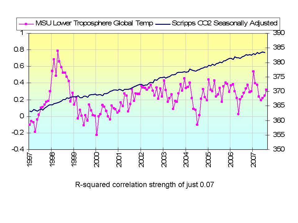